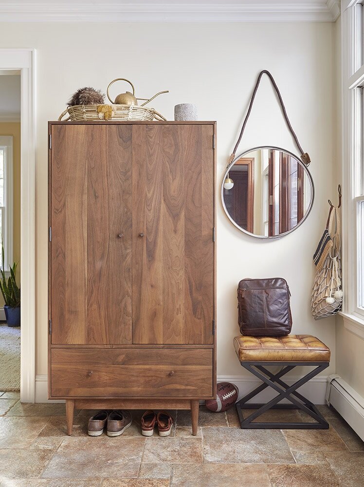
Mid Century Meets Tudor
Inspired by mid-century style, we removed some of the fussy flourishes of the built-in shelves, replacing glass shelves with sturdy solid ones. We removed the chair rail and added a grasscloth wallpaper to bring a textural interest to the space. While there are more pieces of furniture than before, the space flows better because of the scale and placement of the pieces we selected.
While the client purchased a tudor-style home, she had a penchant for mid-century style. We did our best to blend the two, brightening and decluttering the space.


